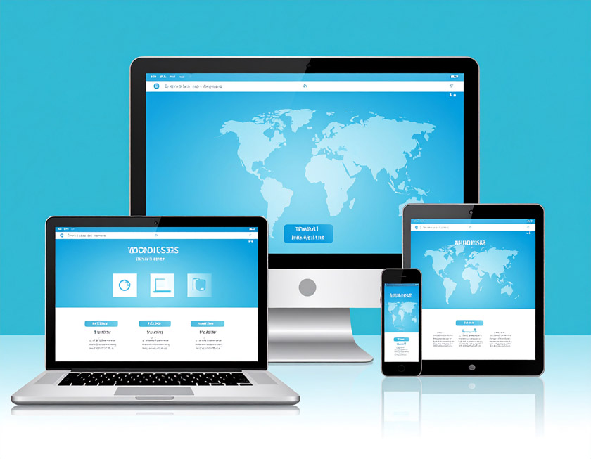
Tips for Responsive Design Without Plugins
Hey there! I’m Mario Donquilab — I create custom websites that look clean, modern, and adapt perfectly on any screen size. On my own site, I don’t use heavy plugins. Here’s how I do it.
1. Use a Fluid Layout
I work with percentages and flexible units like em, rem, and vw/vh. That way, layouts stretch or shrink based on the device, not fixed pixels.
2. Embrace CSS Grid & Flexbox
These two are my best friends for responsive layouts. They allow dynamic positioning, wrapping, and alignment — and they’re baked right into CSS. No plugins required!
3. Breakpoints Are Key
I design mobile-first and then add breakpoints as needed. Here's a sample:
@media (min-width: 768px) {
  .container {
    flex-direction: row;
  }
}
4. Optimize Your Images
I use the <picture> tag and srcset to serve responsive image sizes. Less bandwidth, faster pages.
5. Don’t Forget the Viewport Meta Tag
This is the golden rule for mobile responsiveness:
<meta name="viewport" content="width=device-width, initial-scale=1.0">
6. Test Across Devices
I use Chrome DevTools and test on real devices. What works on desktop doesn’t always feel right on mobile.
7. Keep It Lightweight
Less is more. Avoid bloat. Custom HTML and CSS usually cover everything I need — and my site loads much faster.
With a clean structure, fluid layout, and some scroll animations — you can create a responsive experience that doesn’t rely on plugins. Take a peek at my own website to see how it works in real life!