Why Responsive Web Design Matters (Even If You're Not a Tech Person)
Ever visited a website on your phone and had to pinch, zoom, and scroll sideways just to read a sentence? Annoying, right?
That’s what happens when a website isn’t responsive. But what exactly is responsive web design—and why should you care?
So, What Is Responsive Web Design?
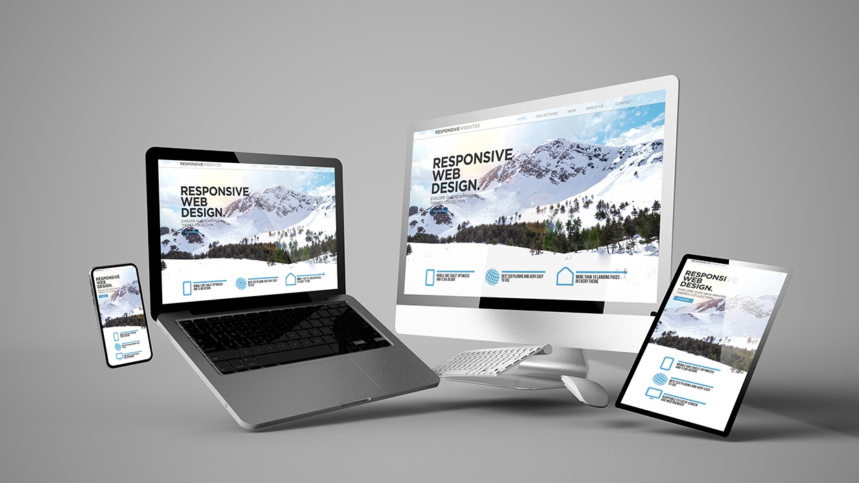
In simple terms, it means a website adjusts itself to look good and work well on any device—desktop, tablet, or phone.
Why Is It So Important?
- 📱 More than half of web traffic comes from phones. If your site isn’t mobile-friendly, visitors leave fast.
- 💻 One site works everywhere—no need for separate mobile or tablet versions.
- 🛍️ Happier visitors = more customers and better results for your business.
- 🔍 Google ranks responsive websites higher in search results.
How Does It Work?
It uses flexible layouts, resizable images, and smart rules that adapt to your screen size—so it always looks good.
What It Looks Like
- 🖥 On desktops: full layout, menu on top, columns.
- 📱 On phones: single column, touch-friendly menu.
Quick Test: Is Your Site Responsive?
- Open your site on a desktop.
- Shrink the browser window.
- If the layout adjusts smoothly—good! If not, time to fix it.
The Bottom Line
Responsive design makes websites friendly for everyone—on any screen. It’s not just for developers—it’s about real people having a better experience online.
So now you know: responsive = smart, flexible, and essential.