Blog
Welcome to My Blog
Get insights, tips, and inspiration on web design, digital marketing, branding, and creative strategy. Whether you're a business owner or a fellow creative, you'll find practical advice and real-world experience shared from my journey in the digital space.
- Details
- Written by: admin
- Category: Blog
- Hits: 356
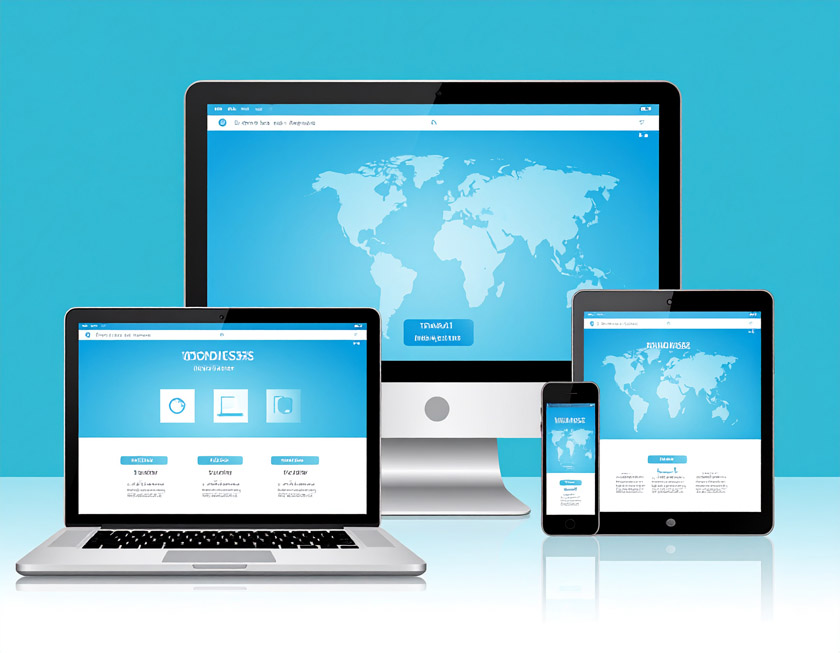
Tips for Responsive Design Without Plugins
Hey there! I’m Mario Donquilab — I create custom websites that look clean, modern, and adapt perfectly on any screen size. On my own site, I don’t use heavy plugins. Here’s how I do it.
1. Use a Fluid Layout
I work with percentages and flexible units like em, rem, and vw/vh. That way, layouts stretch or shrink based on the device, not fixed pixels.
2. Embrace CSS Grid & Flexbox
These two are my best friends for responsive layouts. They allow dynamic positioning, wrapping, and alignment — and they’re baked right into CSS. No plugins required!
3. Breakpoints Are Key
I design mobile-first and then add breakpoints as needed. Here's a sample:
@media (min-width: 768px) {
  .container {
    flex-direction: row;
  }
}
4. Optimize Your Images
I use the <picture> tag and srcset to serve responsive image sizes. Less bandwidth, faster pages.
5. Don’t Forget the Viewport Meta Tag
This is the golden rule for mobile responsiveness:
<meta name="viewport" content="width=device-width, initial-scale=1.0">
6. Test Across Devices
I use Chrome DevTools and test on real devices. What works on desktop doesn’t always feel right on mobile.
7. Keep It Lightweight
Less is more. Avoid bloat. Custom HTML and CSS usually cover everything I need — and my site loads much faster.
With a clean structure, fluid layout, and some scroll animations — you can create a responsive experience that doesn’t rely on plugins. Take a peek at my own website to see how it works in real life!
- Details
- Written by: admin
- Category: Blog
- Hits: 573
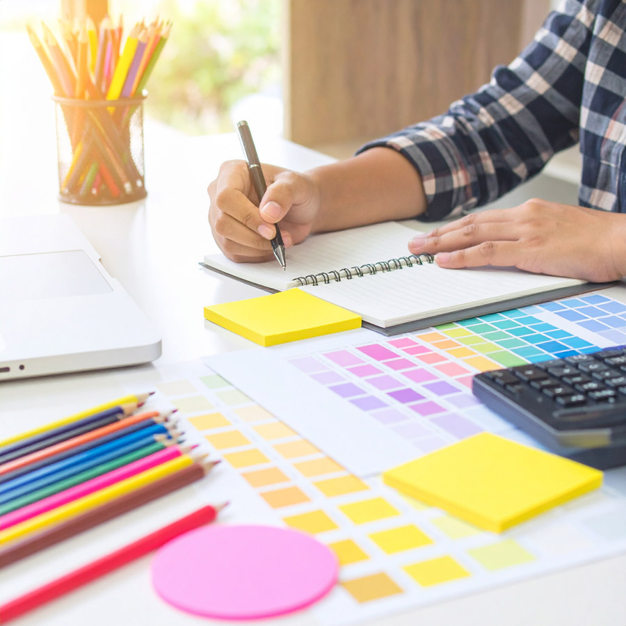
Mastering the Fundamentals: Key Graphic Design Principles
In a world driven by visual communication, graphic design is more than just making things look appealing — it’s about solving problems through effective visuals. Whether you're designing a website, brand identity, poster, or social media post, following solid design principles ensures your message is clear, engaging, and impactful.
Here are the essential graphic design principles every designer should understand and apply:
1. Balance
Balance is about distributing elements evenly throughout your design. It creates visual stability and harmony.
- Symmetrical balance: Elements are evenly weighted on both sides of the composition.
- Asymmetrical balance: Uneven elements are balanced through contrast, color, size, or positioning.
- Radial balance: Elements radiate from a central point.
Tip: Use balance to avoid overwhelming or underwhelming the viewer.
2. Alignment
Alignment ensures your elements have a clear connection and order. Everything in your design should line up intentionally, creating a professional and polished look.
- Use grids and guides to maintain structure.
- Align text and visuals to give the design a clean flow.
Why it matters: Proper alignment builds trust and makes information easier to digest.
3. Hierarchy
Visual hierarchy guides the viewer’s eye through your design — from most important to least.
- Use size, color, contrast, and spacing to establish hierarchy.
- Headlines should stand out; secondary text should support.
Effective hierarchy improves readability and focuses attention where it matters most.
4. Contrast
Contrast draws attention and creates emphasis. It can be achieved through color, size, shape, or typeface.
- Dark vs. light, bold vs. thin, big vs. small — contrast makes design elements stand out.
- It’s essential for accessibility and readability.
Rule of thumb: If everything is emphasized, nothing is.
5. Repetition
Repetition reinforces consistency and brand identity. It ties different elements of a design together.
- Repeat fonts, colors, logos, and shapes to create cohesion.
- Especially useful in multi-page designs like presentations or websites.
Use repetition to create rhythm and recognition.
6. Proximity
Grouping related elements together makes your design more organized and meaningful.
- Place similar items near each other to show they’re connected.
- Helps declutter layouts and improve visual structure.
Proximity doesn’t mean overcrowding — spacing is still key!
7. Color
Color sets the tone, mood, and emotional connection of your design. It can also guide the viewer's eye.
- Use color theory and harmonies (complementary, analogous, triadic) for best results.
- Stick to a consistent palette aligned with your brand or message.
Be mindful: Overusing too many colors can cause confusion.
8. Typography
Typography is the art of arranging text to be legible and visually appealing.
- Pair fonts wisely — usually one serif and one sans-serif works well.
- Be consistent with font sizes, spacing, and weight.
Good typography communicates your message even before reading the text.
Great design isn’t just about creativity — it’s about strategy, structure, and storytelling. Mastering these graphic design principles will help you create work that not only looks good but also communicates effectively.
As a designer, always keep learning, testing, and refining. When you combine these principles with your own unique style and intuition, you’ll produce visuals that truly make an impact.

- Details
- Written by: admin
- Category: Blog
- Hits: 425
- Details
- Written by: admin
- Category: Blog
- Hits: 298
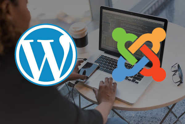
Why You Need a WordPress and Joomla Expert for Your Website
Whether you're building a website for your business, brand, or portfolio, two names often come up: WordPress and Joomla. These content management systems (CMS) power millions of websites around the world. But while both platforms are powerful and flexible, getting the most out of them takes more than just installing a theme or plugin—it requires expertise.
That’s where a WordPress and Joomla expert like myself comes in.
💡 What's the Difference Between WordPress and Joomla?
WordPress is known for its user-friendly interface, large plugin ecosystem, and versatility. It’s ideal for blogs, business websites, and even e-commerce with tools like WooCommerce.
Joomla, on the other hand, offers more advanced control over site structure and user permissions. It’s a go-to choice for developers building complex, multilingual, or community-driven websites.
Both are powerful—but which one fits your needs depends on your goals.
🚀 Why Work with an Expert?
- ✅ Custom Design & Branding
No cookie-cutter themes. I create modern, responsive websites that reflect your brand identity—whether you're a realtor, small business, or creative professional. - ✅ Faster Setup & Better Performance
Skip the trial and error. I know the best themes, plugins, extensions, and configuration settings to make your site load fast and run smoothly. - ✅ Mobile-Optimized & SEO-Ready
Both platforms support SEO features, but only with proper setup. I ensure your site structure, metadata, and mobile responsiveness follow best practices for Google rankings. - ✅ Maintenance & Security
Outdated plugins or weak hosting can break your site. I offer ongoing maintenance to keep everything secure and up to date. - ✅ Migrate Between WordPress & Joomla
Switching platforms? I can migrate your content, design, and SEO settings from WordPress to Joomla—or vice versa—without losing data or quality.
👨💻 Why Choose Me?
With years of experience in WordPress, Joomla, graphic design, social media marketing, and video editing, I bring a holistic approach to building your online presence. I don't just design websites—I create digital tools that support your business goals.
Ready to Get Started?
Let’s talk about how I can help you build or upgrade your WordPress or Joomla website. Whether you need a sleek portfolio, a property listing site, or a business hub, I’ve got the skills to make it happen.